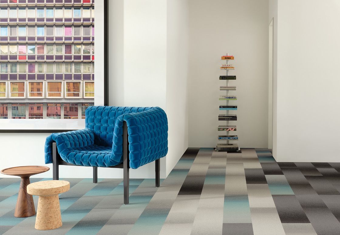
Often overlooked, but always critical, there is a huge amount of color psychology when it comes to interior design for commercial spaces! Color trends come and go, as each year a new color reigns supreme. When choosing interior design selections for a commercial space it's important to pick colors based on longevity and psychology rather than trends. Think about it, if you're redesigning a country club going full-on-trend with modern black might not be the best choice for your space and brand! Color psychology in commercial spaces can be confusing, but we are going to break down the psychology of color and interior design so your next commercial project can have longevity and style for the many years to come.
Neutrals: Simple, classic, and safe
Neutrals are a simple, classic, and safe color choice when it comes to any commercial environment. When designing a commercial space with neutral colors you never have to worry about your design becoming outdated or disruptive in day-to-day activity. Warm neutrals evoke a sense of calm in your environment and keep your senses from being overloaded. Neutrals are particularly popular in both residential and commercial settings. Neutrals are the chameleon of color ranges, they allow the owner to change up their style while keeping with a design that is always current.

We love them in condos and hotels as the sense of warmth and security they provide can make a temporary boarding or gathering space feel like home! Flooring with neutral color choices and window treatments is always a reliable choice for commercial spaces.

Offices can also capitalize on the warm welcoming comfort that calming rich neutrals give! Neutral carpet tiles are a great option for offices and can make a workspace feel homier. After the change in working environments due to the pandemic, workspace comfort has taken a huge priority with employers.

Green Zen
To break down some more colors, Green is also a great base when it comes to commercial spaces. Green invokes a sense of peace and harmony in a space. Green represents balance, growth, and peace. When it comes to office spaces, green accent walls and green plant decor work best! Adding green to common spaces like employee lounges can also help your employees relax during their off time so they can gather their energy again! Green decor freshens up a space and pairs with just about any type of floor and wall choice.

Places like hospitals or commercial rooms that are going to be inhabited for longer periods of consecutive time benefit from the color psychology of green interior design, as green keeps individuals more relaxed.

Power Up with Red and Orange
Peace and zen is not always the best direction commercial spaces need! Red is a great color to design with if you have a commercial space that needs a little more energy and passion breathed into it! red tile walls and floors are great for commercial spaces like gyms, cafeterias, conference rooms, communal cafeterias, and late-night businesses that keep night hours! Keep it bold with red as a design base or go more subtle with reds as decor pieces!

Red and orange colors work best in a more relaxed environment as these colors psychology excite a person and can actually increase heart rate and blood pressure. These colors are great for amping people up but might not be the best choice for hospitals or school classrooms!

Keep the optimism with Yellow
Yellow is a bright-toned color that is great for waiting rooms and conference rooms! Yellow increases optimism, productivity, and creativity! From a design standpoint, yellow, is great to design with as it complements natural lighting beautifully and can easily be combined with, white, neutrals, and even greens when designing a commercial space. Yellow is a great color option for creative spaces as it promotes creativity!

Trust the process with Blues & Purples
Blue is a color staple in commercial space design. Blue is the color of trust and dependability! Another color that does great in medical offices, schools, and commercial spaces all alike, shades of blue and purple have authoritarian cognition. They are not as bright as yellow and red colors and have a more calming air to them!

Keep it classy with Blacks & Whites
Designing a commercial space using black and white colors doesn't mean designing a boring space, it's usually quite the opposite! Black is the color of power and elegance, while white represents purity and cleanliness! These two colors alone are powerful in commercial settings, they are always on trend! Combining these two-color or even choosing a gray in between these two, creates a balancing effect to your commercial design that is both aesthetically pleasing and creates a sense of peace.

